Data Visualization App
Overview
Understanding data is a fundamental skill in today’s data-driven world, and this Streamlit app is designed to make learning and exploring data distributions both intuitive and engaging. Whether you’re a student, data enthusiast, or professional, this app allows you to generate, visualize, and experiment with different statistical distributions in an interactive way. By leveraging Streamlit, Plotly, and NumPy, this app transforms abstract statistical concepts into visual insights, making learning both accessible and fun.
Why Use This App?
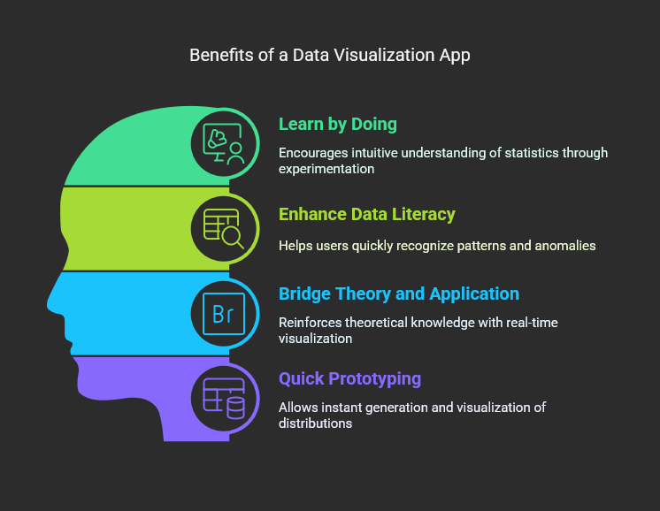
- Learn by Doing: Experimenting with different data distributions helps build an intuitive understanding of statistical concepts.
- Enhance Data Literacy: Visualizing data in various forms allows users to recognize patterns and anomalies quickly.
- Bridge Theory and Application: Students and professionals can use this tool to reinforce theoretical knowledge with real-time visualization.
- Quick Prototyping: Analysts and data scientists can generate and visualize distributions instantly without writing complex scripts.
How It Works
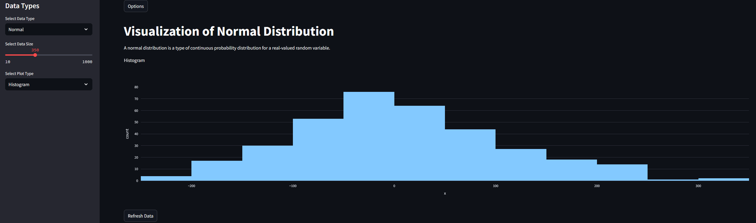
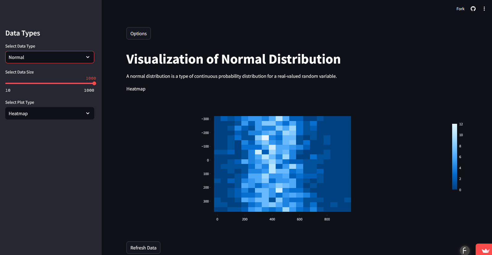
- Select a Data Type: Choose from a range of statistical distributions.
- Adjust Data Size: Use the slider to set the number of data points.
- Choose a Visualization: Pick from various chart types.
- Explore the Data: View a brief summary and interactive visualization.
- Refresh Data: Generate a new dataset at any time.
Try It Yourself
Open Live Demo
Features
- Dynamic Sidebar Controls
- Toggle sidebar state for better user experience
- Select different data types including Normal, Non-Normal, Random, Linear, Exponential, Poisson, Gamma, and Skewed
- Adjust the sample size with an interactive slider
- Choose from multiple visualization types: Histogram, Line Chart, Scatterplot, Heatmap, Box and Whisker Plot, and Bar Chart
- Data Generation
- Uses NumPy to generate various types of distributions
- Provides a brief summary of each distribution type to enhance learning
- Data Visualization
- Uses Plotly to create interactive charts
- Automatically updates charts based on user input
- Additional Features
- Refresh data functionality to generate new samples
- GitHub link to source code
- Footer crediting ChatGPT for assistance in development
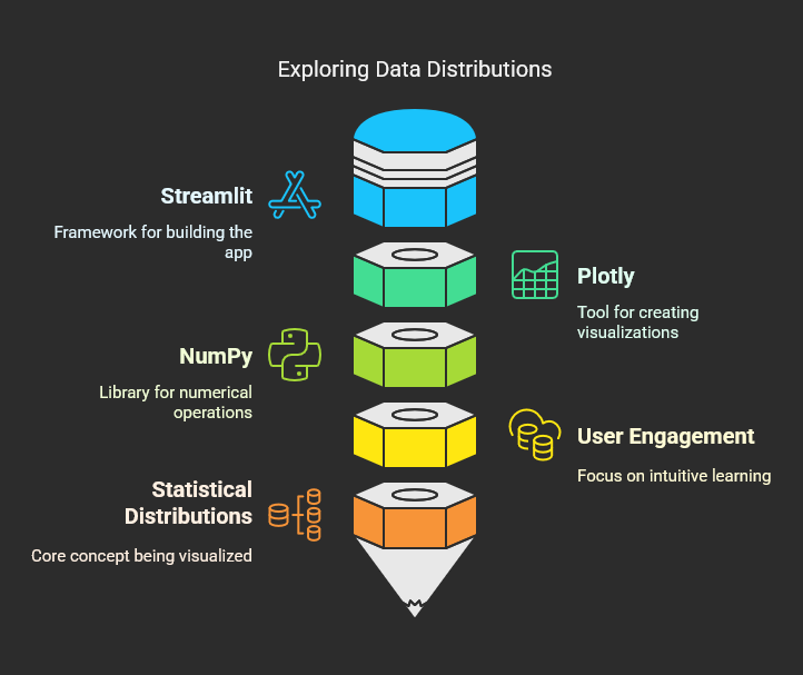
Technologies Used
- Streamlit: For building the interactive web-based application
- Plotly: For creating dynamic visualizations
- NumPy: For generating statistical data distributions
- Pandas: For handling data transformations
- Streamlit Components: For embedding custom HTML elements
Live Demo & Source Code
Check out the source code on GitHub: beautifulcharts
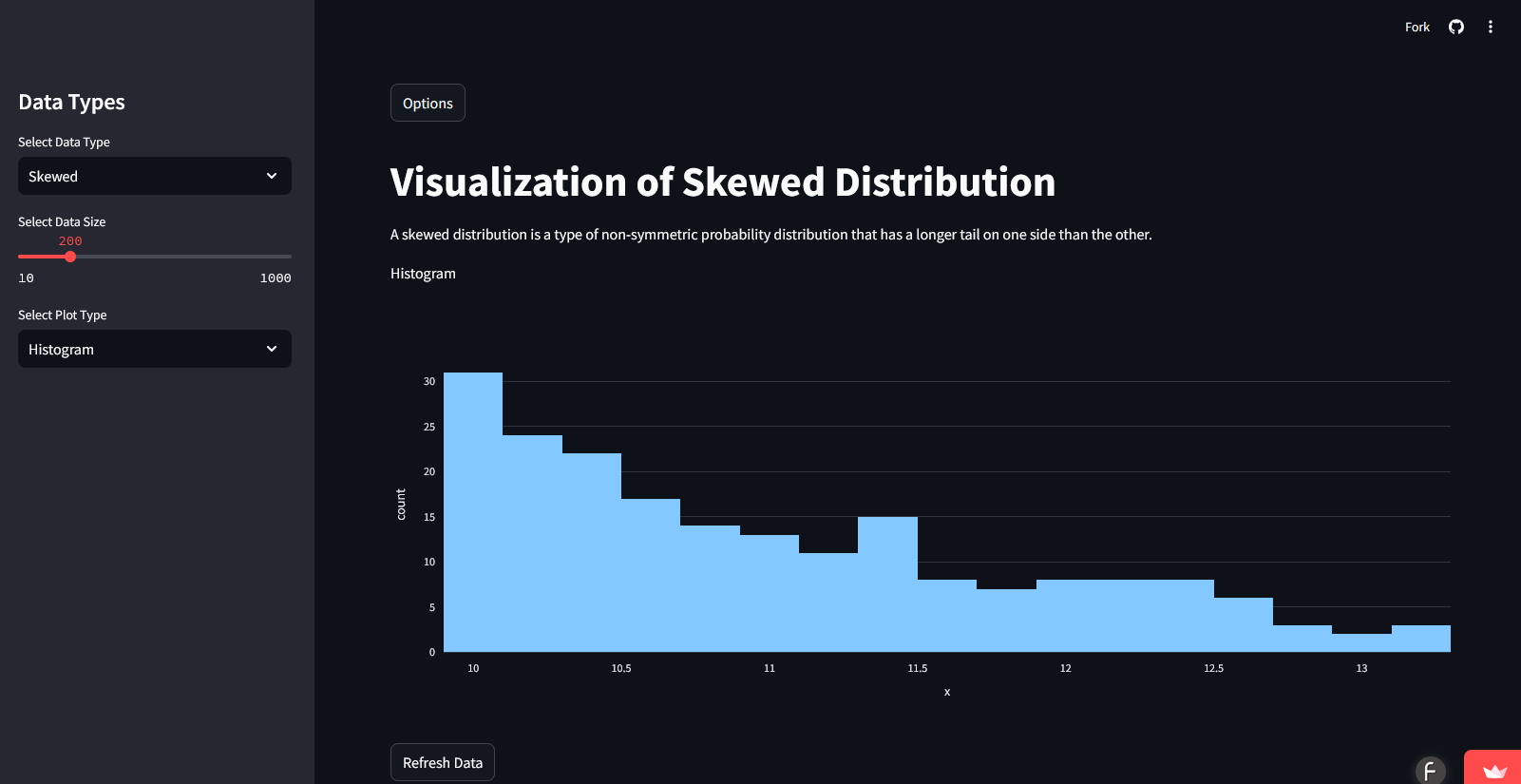
Screenshots
Note: See the details on GitHub, beautifulcharts.