A Month Inside My Home’s Microclimate (and 5 Days in a Camper)
Two Raspberry Pis in my house have been reporting ambient temperature and humidity every minute for a month: a Pi Zero downstairs in the dining room, and a Pi 3 B upstairs in my office. Each is a tiny thing — a cheap board and a bargain DHT22 sensor — but they never stop, so they produce the kind of record you can’t get by checking a thermostat twice a day.
Then, without meaning to, I ran an experiment. The downstairs Pi came with me in a camper to Raleigh, North Carolina for five days in early September. It kept recording the whole time. That gives the same sensor, the same wiring, the same calibration, in two completely different environments — and it turns out the camper days are the most interesting part of the data.
So here’s a month: 27 days at home and 5 days on the road for the dining-room sensor, with the office sensor quietly logging in parallel the whole time — 74,000 readings between them.
The month at a glance
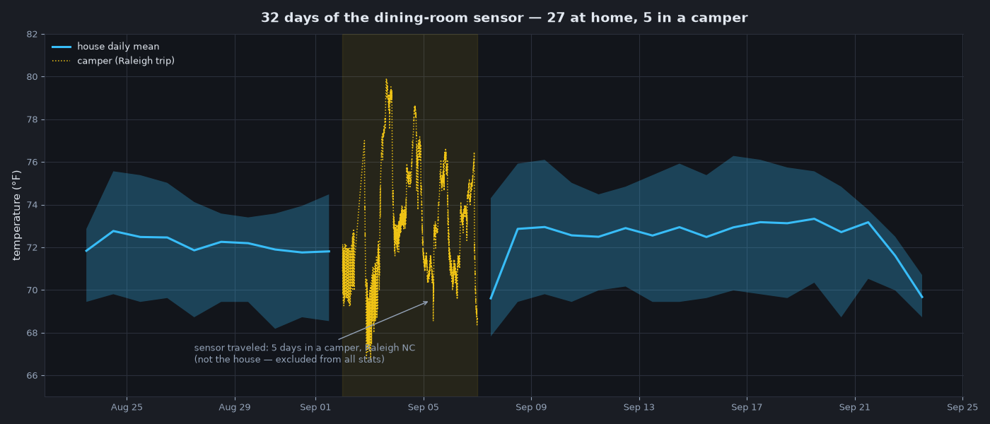
The blue band is the dining room’s daily min–max, with the mean as a line. The yellow dotted line is the raw sensor output on the five days it was in a camper instead.
The first thing that jumps out is how little the dining room moves. Over 27 days it stayed between 67.8 °F and 76.3 °F — a total span of 8.5 °F across a month where the weather outside was doing its own thing entirely.
The second thing is the gap where the camper is. Those five days are plotted raw, minute by minute, because a daily average would hide what’s actually going on: the readings swing much harder, as you’d expect from a small box with no real climate control in the September sun.
| Readings | Min | Mean | Max | Range | |
|---|---|---|---|---|---|
| Dining room, downstairs (27 days) | 31,429 | 67.8 °F | 72.4 °F | 76.3 °F | 8.5 °F |
| Office, upstairs (all 32 days) | 37,353 | 70.3 °F | 77.1 °F | 80.6 °F | 10.3 °F |
| Camper — dining-room sensor (5 days) | 5,773 | 66.7 °F | 73.3 °F | 79.9 °F | 13.1 °F |
The dining-room row covers only the 27 days that sensor was actually home. The office Pi never left, so its row spans the full month.
Here’s the part I didn’t expect: the camper wasn’t hotter on average. Its mean was 73.3 °F against the dining room’s 72.4 °F — less than one degree apart. What changed wasn’t the average temperature, it was the stability.
The dining room barely has a day
Most temperature data has an obvious rhythm: cool before dawn, warm in the afternoon. Mine doesn’t, and that’s the finding.
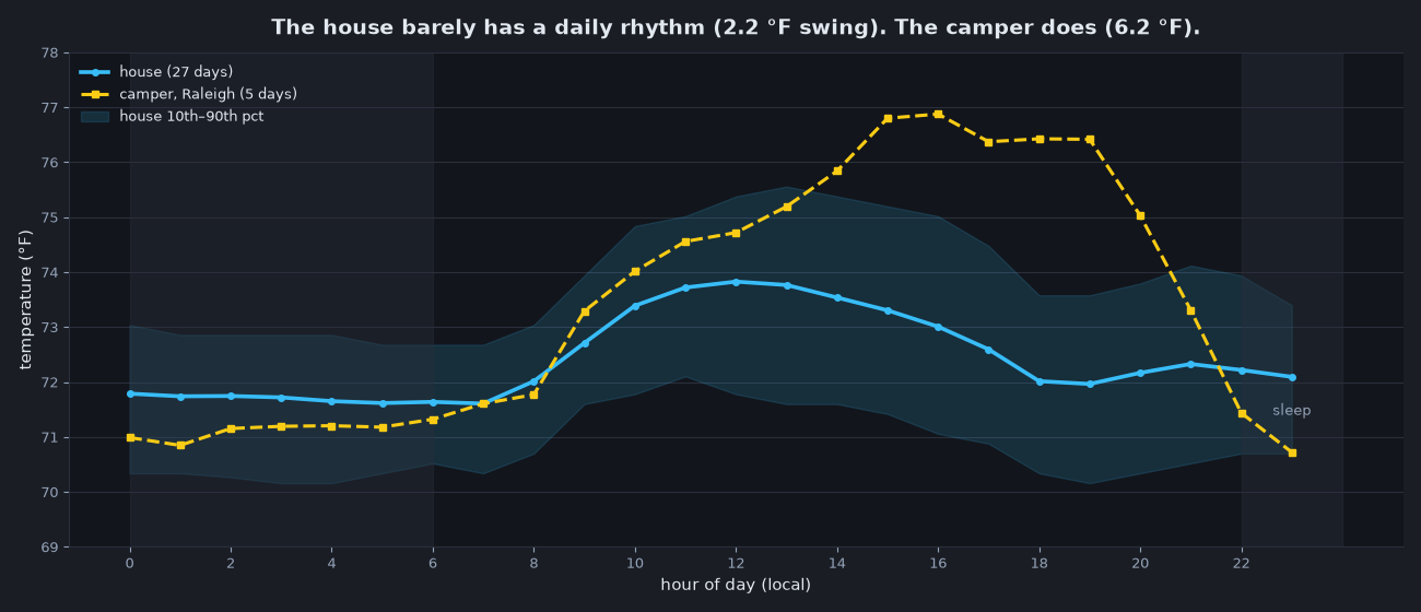
Averaged across all 27 dining-room days, the difference between the coolest hour of the day (07:00, 71.6 °F) and the warmest (12:00, 73.8 °F) is 2.2 °F. The overnight-to-daytime difference is even smaller: 1.4 °F between the sleep window and the working day. The shaded band shows the 10th–90th percentile for each hour — on a typical day, the dining room sits in a window barely two degrees wide.
The office is even flatter: 0.8 °F between its coolest and warmest hours — it just sits five degrees higher, at roughly 77 °F all day.
The camper, same sensor, shows a 6.2 °F swing across the day — nearly three times as much as the dining room — with a morning trough and an afternoon peak that actually look like a daily cycle.
The house is conditioned — split HVAC, one unit for each floor — so something is actively flattening the curve; the camper is a small, mostly sealed box in the sun. Either way, the practical upshot is that my indoor climate is driven by weather, not by time of day. The warmest day of the month (September 19, mean 73.3 °F) and the coolest (September 7, mean 69.6 °F) are five degrees apart, while every single day looks nearly identical hour to hour.
Every minute of the month
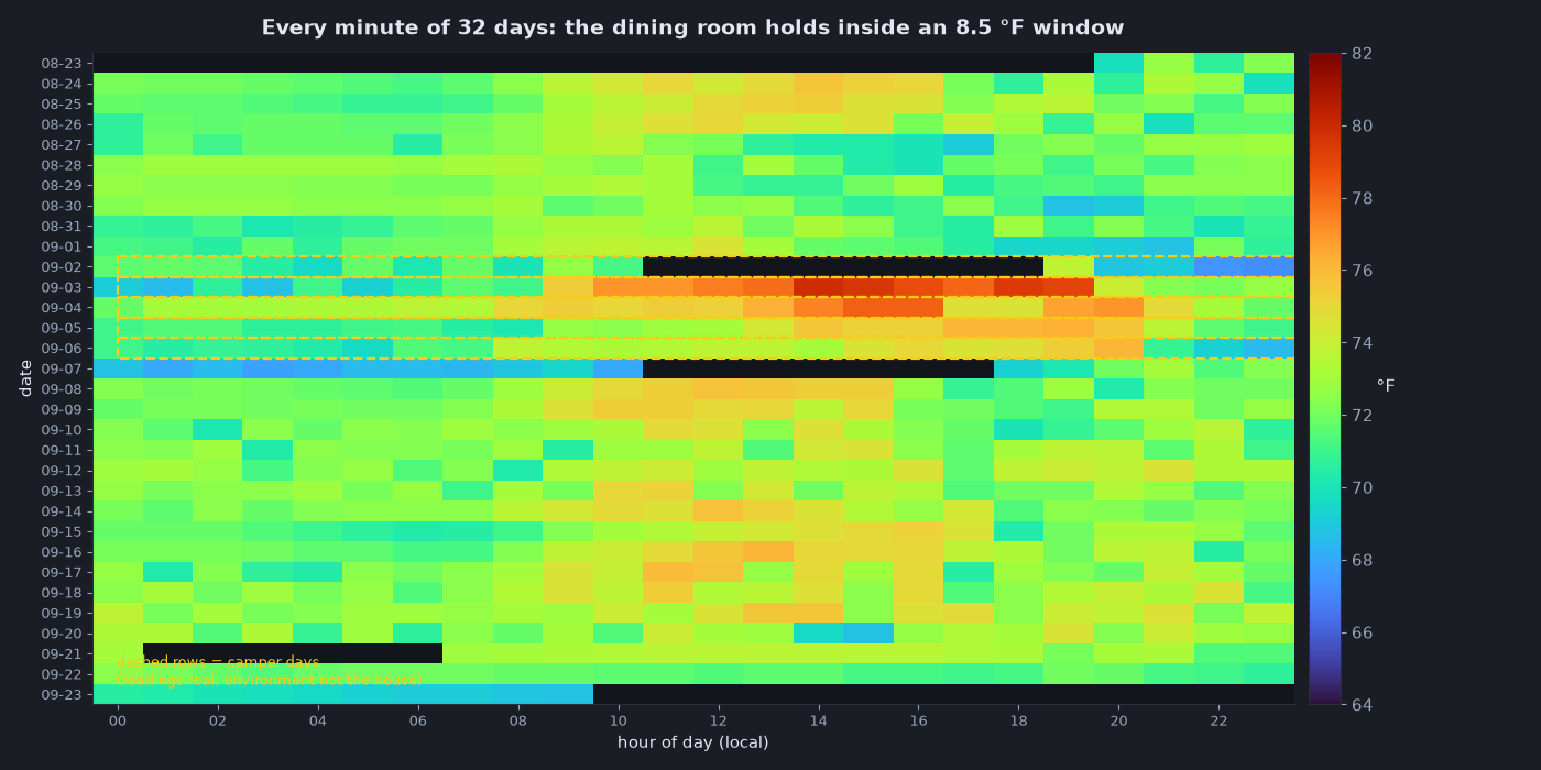
This is the chart I’d frame if I had to pick one. Each row is a day, each column an hour, and colour is temperature. The dining-room rows are almost featureless — that’s the point. You can see the whole month drift slightly warmer through mid-September and then cool off, but there are no dramatic bands, no hot afternoons, no cold nights.
The five dashed rows — September 2 through 6 — are the camper, and you can read the difference directly: colour that changes as you move right across the row, warm evenings, and a couple of genuinely hot afternoons peaking at 79.9 °F.
I’ve kept those rows visible on purpose. They’re real measurements from a real device, they just aren’t measurements of my house, and a chart that quietly dropped them would be lying about what the sensor saw.
Two climate knobs, moving independently
Temperature isn’t the whole story. The same sensor reports relative humidity, and it behaves completely differently.
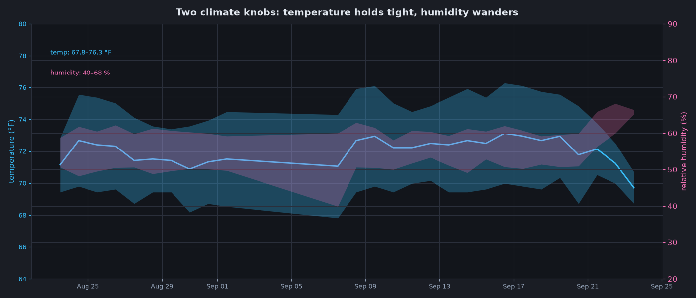
Humidity wandered between 40 % and 68 % over the month — a much wider relative swing than temperature — without any obvious pattern. And when I compared it minute by minute against temperature across all 31,000+ house readings, the correlation is essentially zero (r ≈ 0.03).
That’s worth pausing on, because outdoors, temperature and relative humidity are famously inversely correlated: warmer air can hold more water, so relative humidity drops when temperature rises. Indoors, that relationship has vanished. Something in each zone is managing moisture independently of temperature — the two metrics are just… separate knobs. The office shows the same disconnect on a drier baseline: 22–57 % humidity (mean 49 %) against the dining room’s 40–68 % (mean 57 %), and neither one tracks temperature. If I’d only looked at temperature I’d have assumed a calm, stable climate; the humidity data says the indoor environment is far more variable than the temperature line suggests.
The widest gap in the data is between two rooms in the same house
The second Pi sits upstairs in my office / computer room; the Pi Zero sits downstairs in the dining room. Because both log the same way, they can be compared minute by minute — 26,700+ aligned pairs across the 27 days they share.
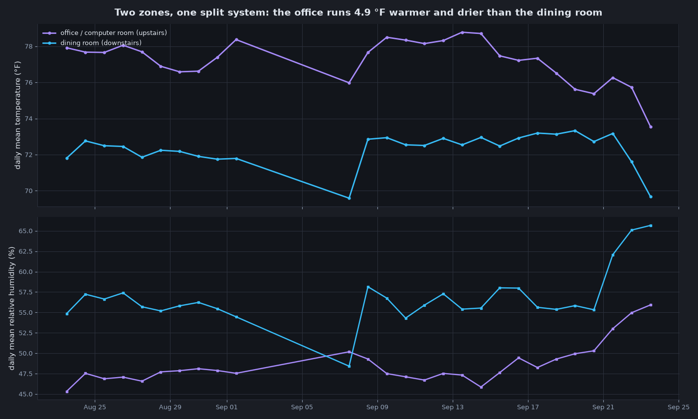
The office runs 4.9 °F warmer on average than the dining room, and the gap reaches 10.3 °F at its widest. It’s also drier — 49 % mean humidity against 57 % — which is a plausible signature of a room full of computers on its own zone.
That 4.9 °F is larger than the dining room’s entire daily swing (2.2 °F), larger than the difference between most individual days, and more than half of the dining room’s whole-month range.
The mechanism isn’t mysterious: the house has split HVAC — one unit for upstairs, one for downstairs — so the two zones are controlled separately. Add a room full of computers and it’s no shock that the office sits higher. What surprised me is the size: nearly five degrees of average difference between two thermostatically controlled zones on the same days, with no dramatic weather to explain it.
So my indoor climate doesn’t have “a” temperature — it has a distribution, and where you stand matters more than what time it is. A single sensor is a sample, not a truth. Placement, height, airflow and sun exposure all matter, and my two devices are doing exactly their job by disagreeing.
What a month of this is worth
None of this required anything exotic: a couple of cheap Pis, a DHT22 each, a small time-series database, and a dashboard I rarely look at. The value isn’t the monitoring in real time — it’s that a month later I can answer questions I didn’t ask at the time:
- Is the house actually stable? Per zone, yes: the dining room held inside an 8.5 °F window over a month, the office inside 10.3 °F, and both barely move hour to hour.
- Does the split HVAC show up in the data? Yes. One unit upstairs, one downstairs, and the two zones average 4.9 °F apart — with the room full of computers running both warmer and drier.
- What does “comfortable” mean numerically? 67.8–76.3 °F and 40–68 % humidity downstairs; 70.3–80.6 °F and 22–57 % upstairs. There is no single house number, and that’s the honest answer.
And the accidental experiment: the 5 days in the camper turned out to be the most informative five days on record, not because the environment was extreme, but because the same instrument made the comparison explicit.
If you want to run the same thing, the collectors are plain Python — a DHT22 on a GPIO pin, logging once a minute into InfluxDB — and the scripts are public: DovarFalcone/pi-scripts. The sensor is still running, and next winter’s data should be interesting.
All readings are minute-precision from two Raspberry Pis (DHT22 ambient sensors, 32-day window ending September 23, 2026): a Pi Zero in the downstairs dining room and a Pi 3 B in the upstairs office. The five camper days (September 2–6, Raleigh, NC) are excluded from every dining-room statistic and kept visible in the charts where noted. Humidity and temperature values are raw sensor output — cheap sensors, honest about their tolerances.